Apple Holidays Bringing the Gift of Product
How to Make the World's Most Notable Brand Festive
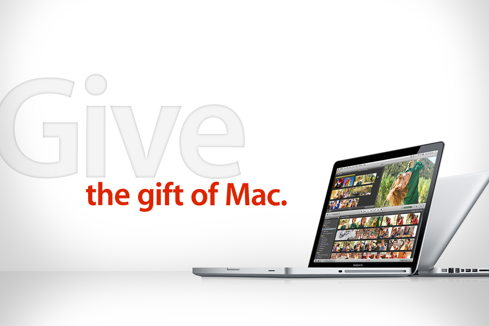
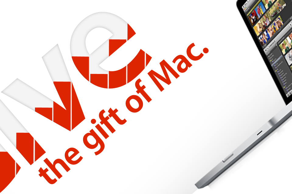
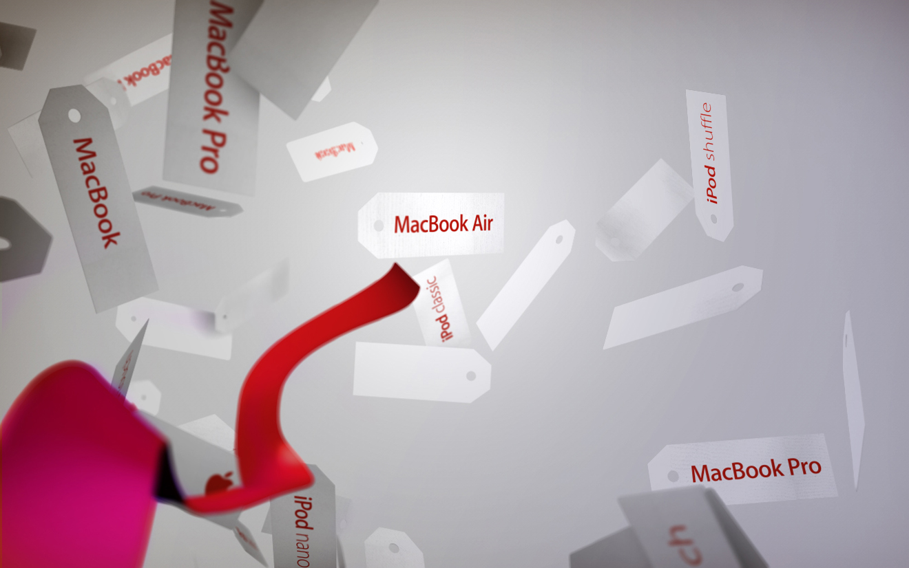
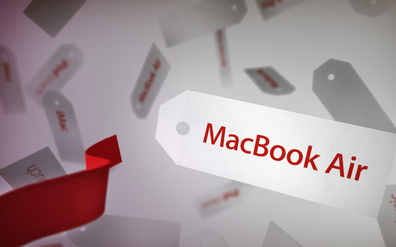
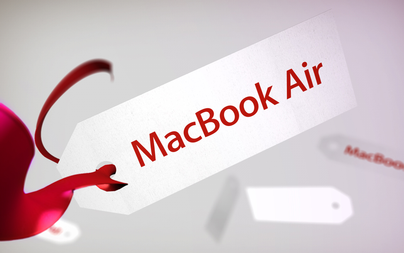
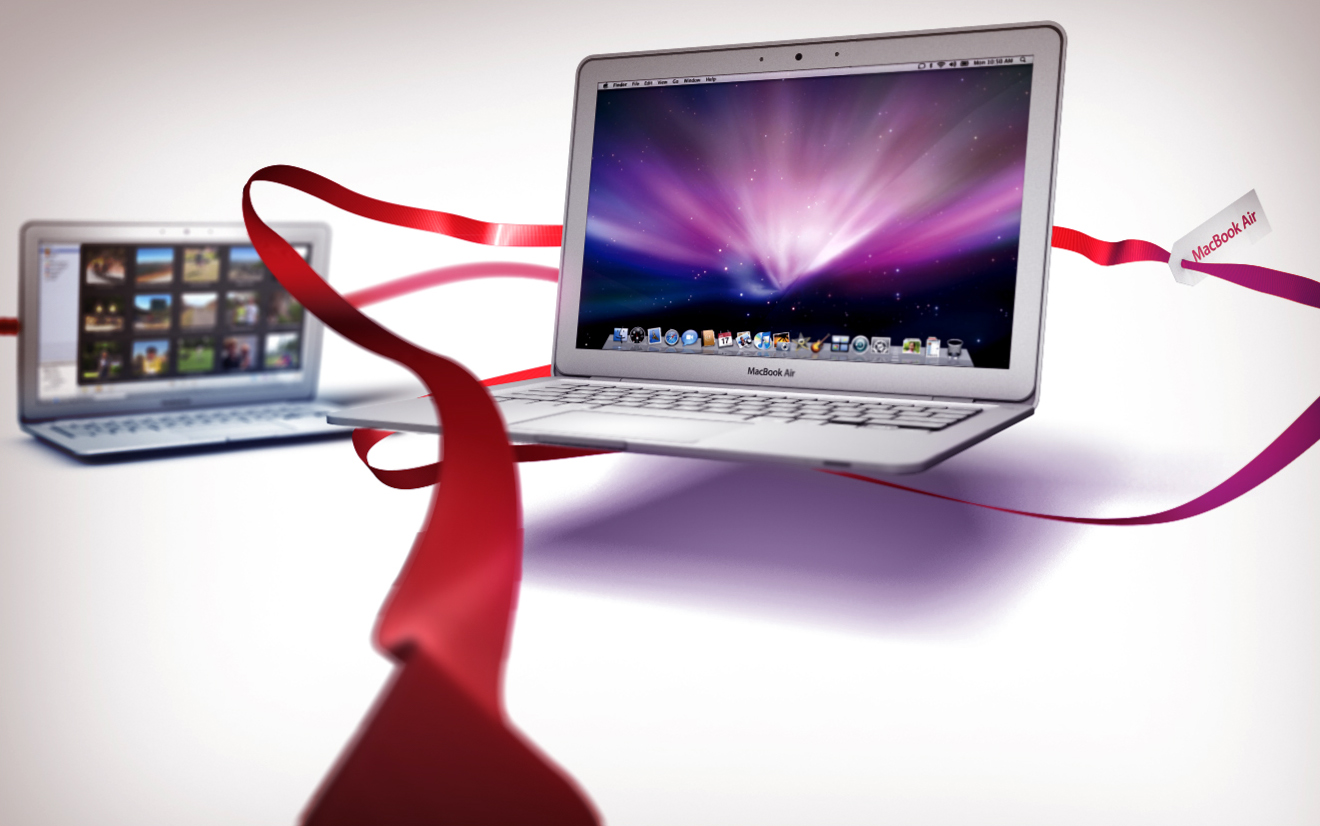
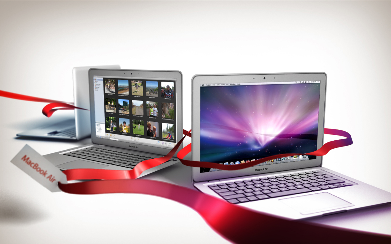
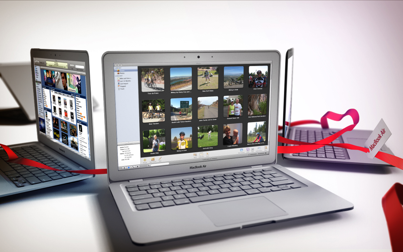
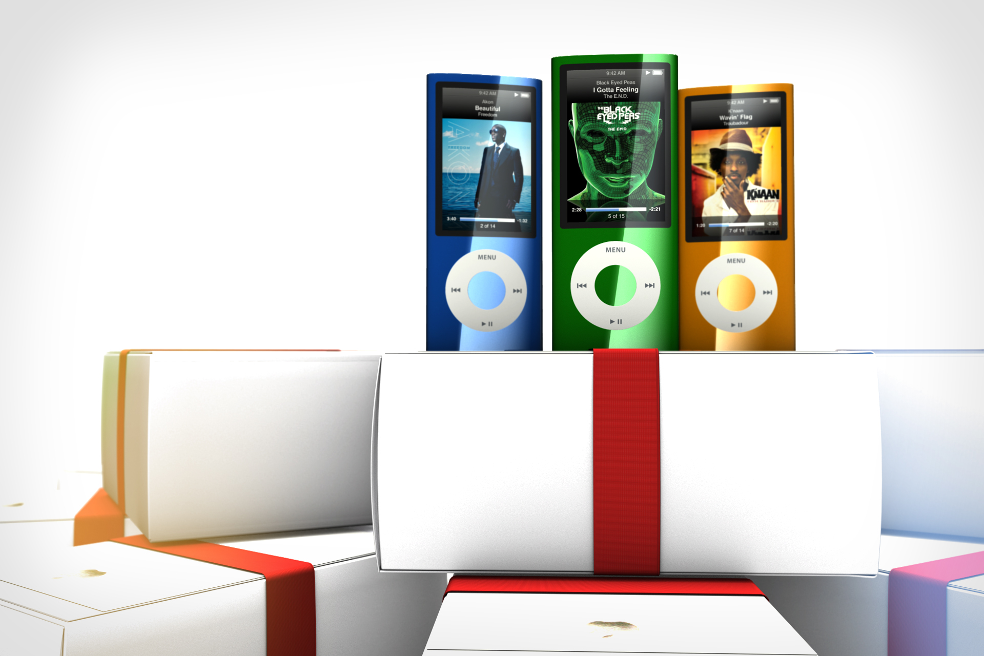
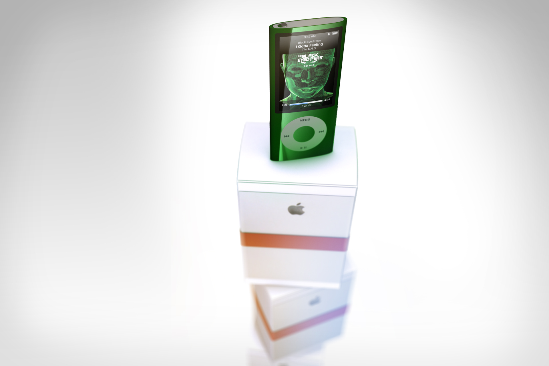
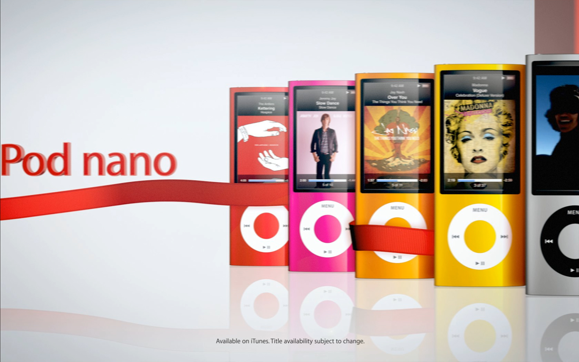
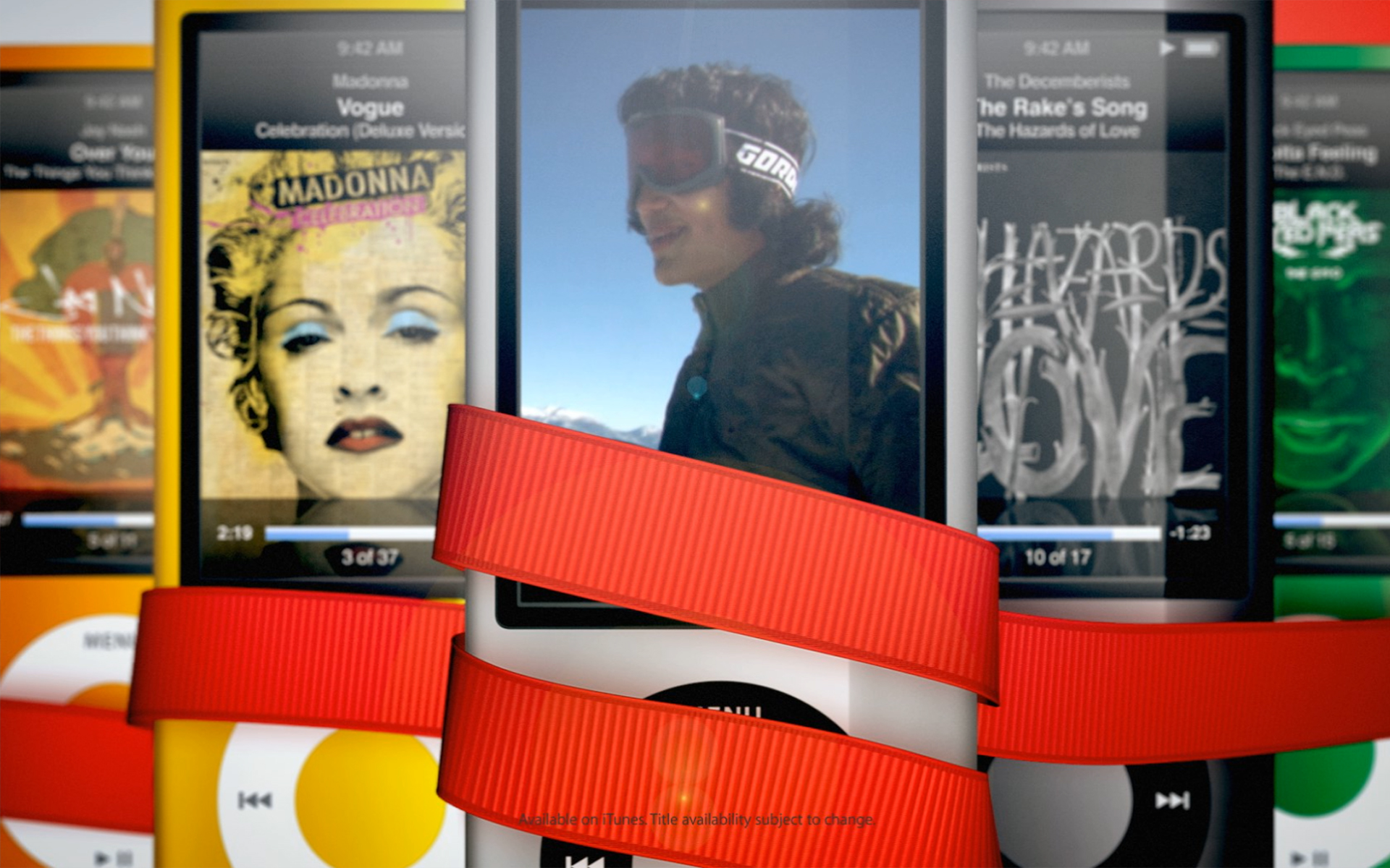
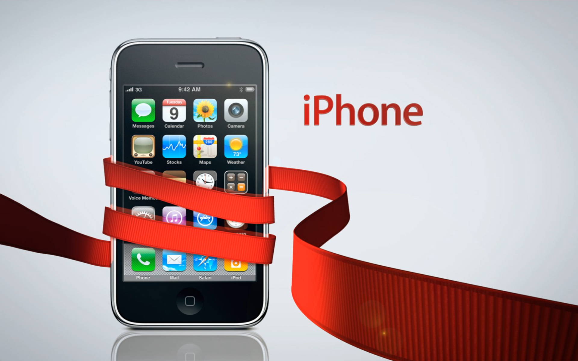
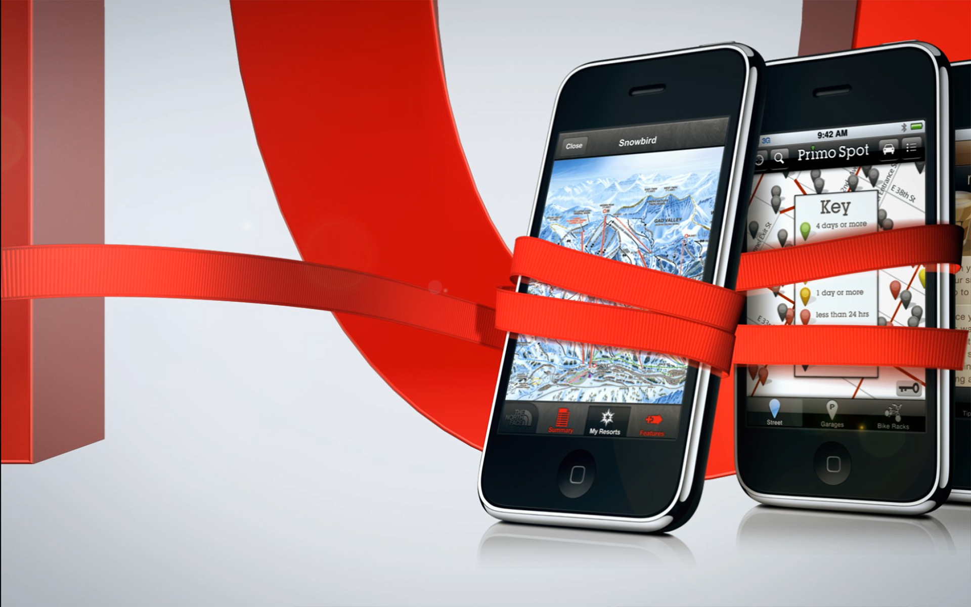
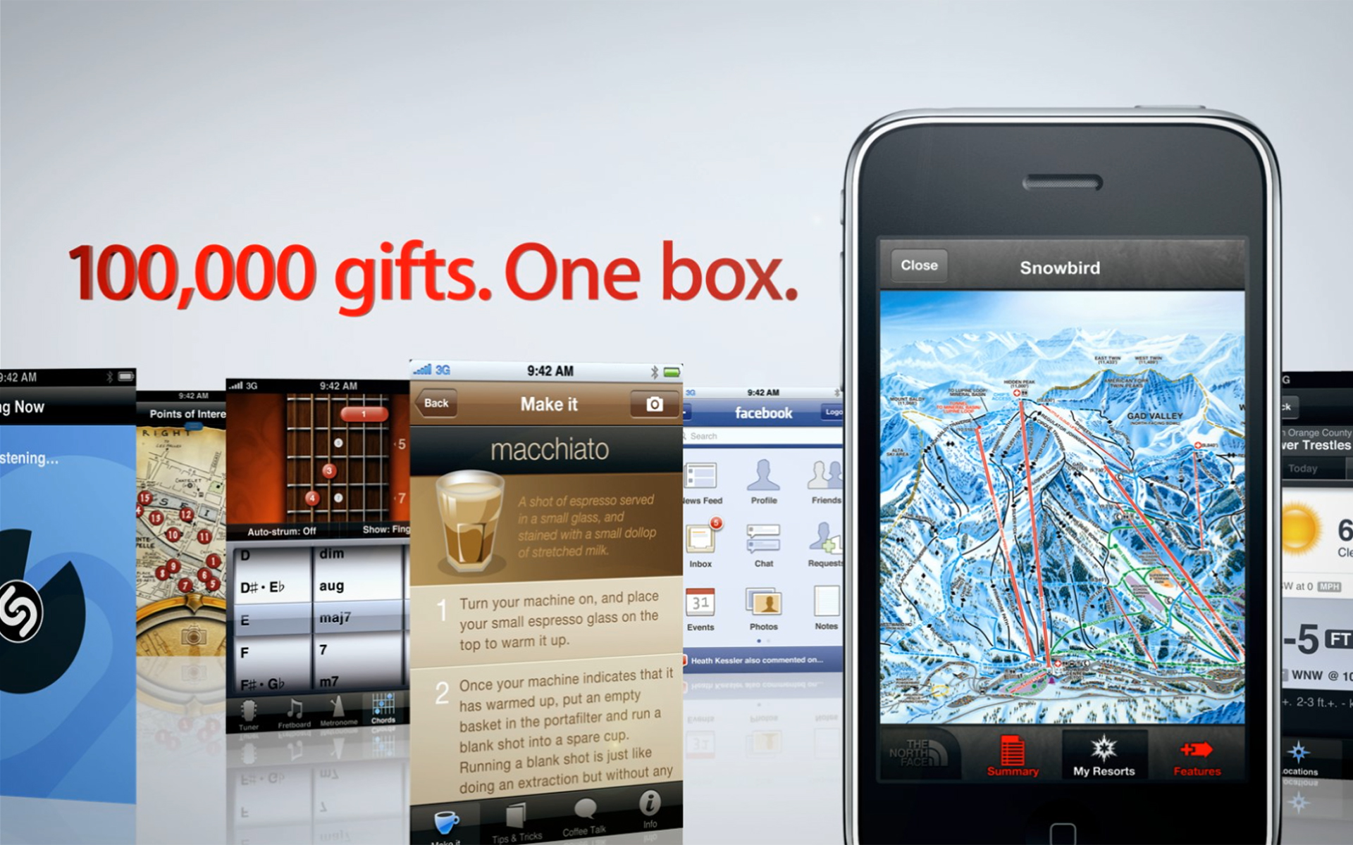
Anytime a Brand gets as large as Apple Inc, any desires for evolution or change are met with resistence and apprehension almost constantly. When a brand is this valuable, evolving it is a very difficult matter, especially for something as globally polarizing as Christmas. The Brand team, for this first design, gave us these tags, gift boxes and a ribbon as added visual elements and beyond that, nothing more than the products and typefaces we were allowed to use through the year. My concept was based around the ribbon being a character moving through the 3D world, intent on wrapping up different products that were to be gifted during the hoilday season. The energy displayed in the frames was to grant a sense of life and purpose as the ribbon navigated it's way through a very 'Apple branded' space and pulling the viewer along with it.


Stylized Realism to Walk a Fine Line Between Stagnant and Unpredictable
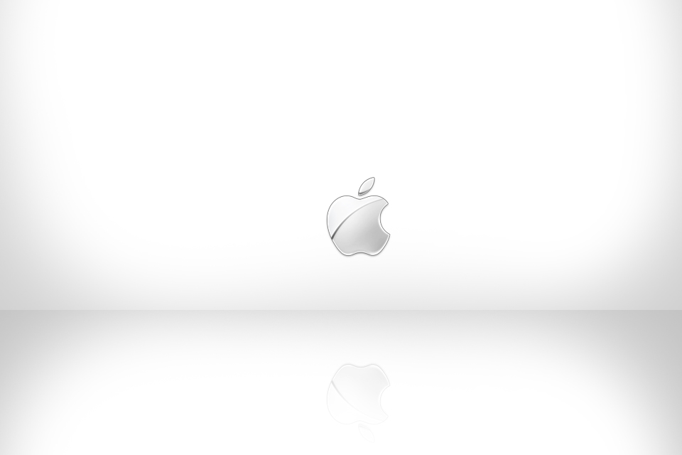
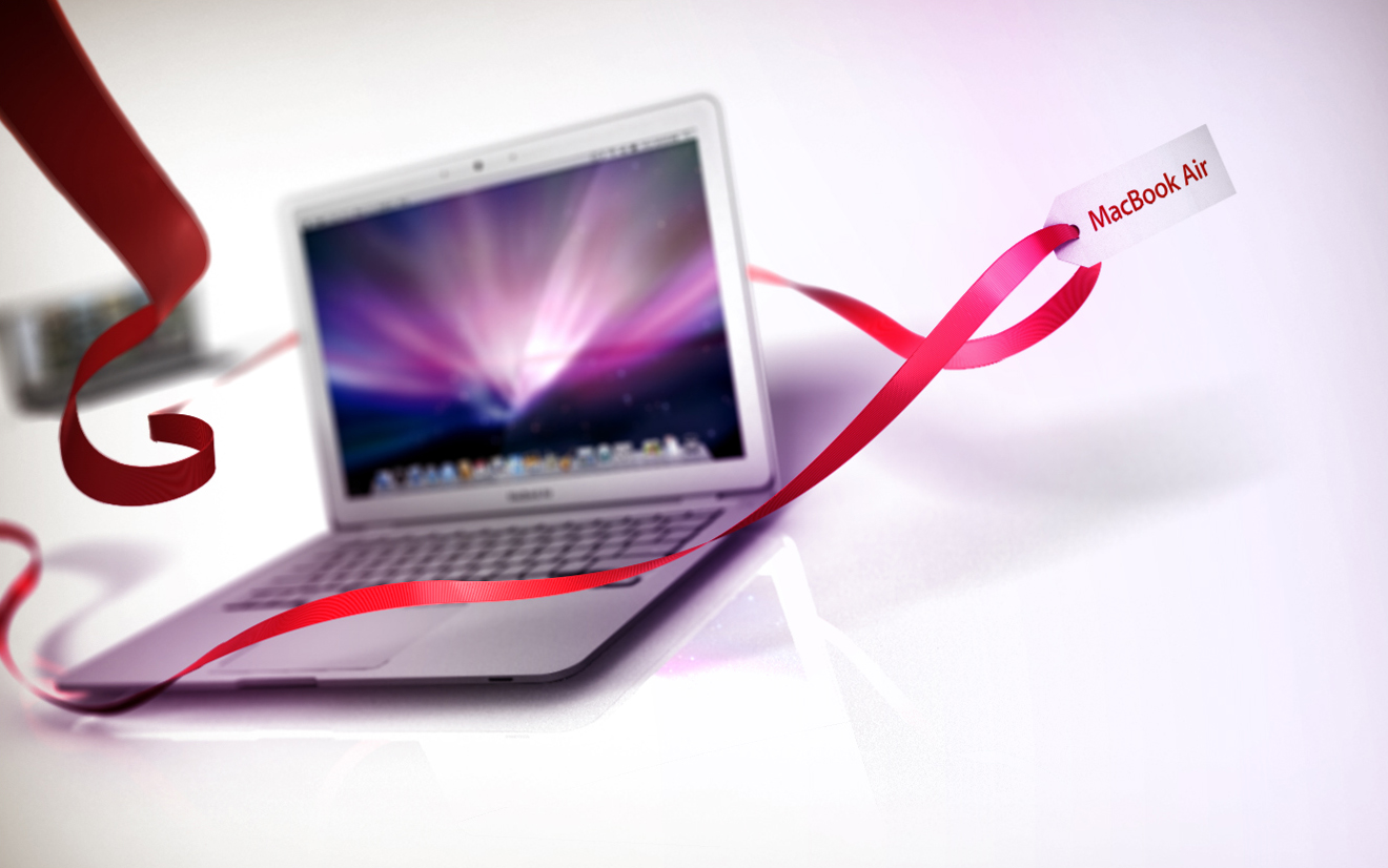
Apple's Brand, since the company's resurrection by Steve Jobs, has been an incredibly clean brand that sits on the fence between realism and minimalism. Stark white or black environments, glossy reflective floors, defined and gradiated reflections and colorful screen composites. With such a limited toolbox, the energy of camera moves, themselves, become huge actors in the final experience. For the final output of this holiday package, the camera pans between micro and macro perspectives, and the sweeping ribbon connecting all the pieces together brought about a loop that adhered to the Apple Brand while adding a little festivity to the end result. The difficulty comes in knowing how far to go so that there is evolving beauty in the visuals without the brand looking tired and boring.
Pushing a Juggernaut Brand is Trial by Fire
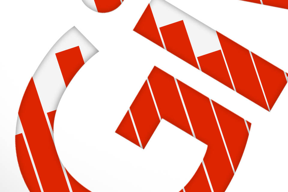
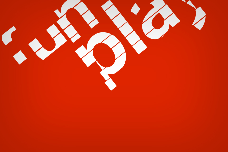
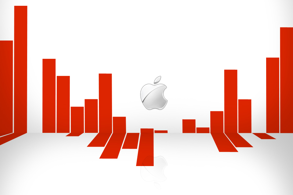
An earlier approach at creating holiday visuals was less successful and too 'design-y'. Utilizing the red ribbon in ways that were different and unique, I tried some frames where the ribbons were more symbolic and textural. Although some of the frames had a nice graphical look, the were quickly rejected because it was too far of a deviation for Apple's stalwart look. Sometimes you just gotta throw things out there to see if anything works, in this case it really didn't and that's okay.